In the changing landscape of internet usage, responsive design and mobile-first sites have become crucial for remaining relevant on the interwebs. Throughout the following paragraphs, you'll come to learn several key factors that will aid you in creating a mobile ready website.
Adaptive Images
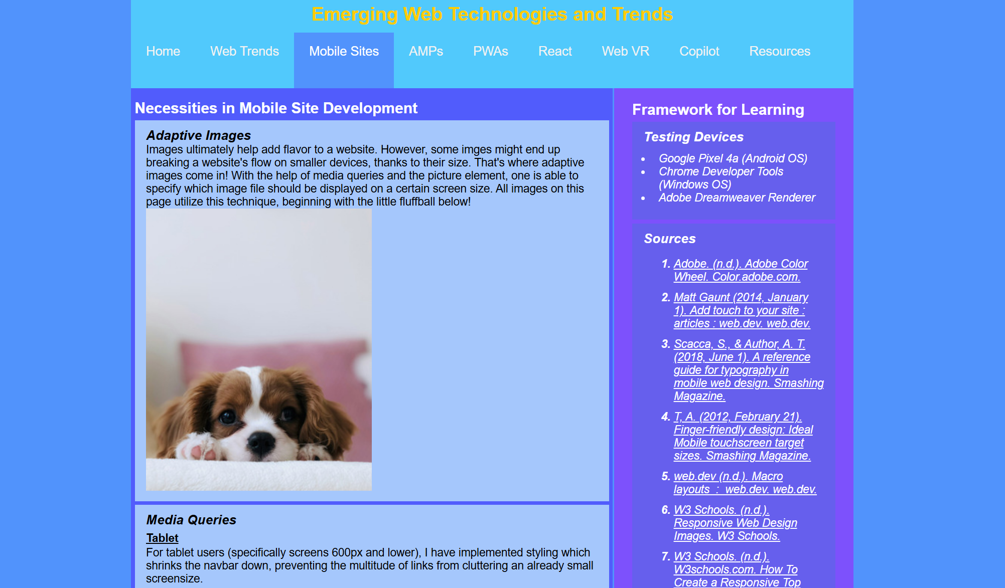
Images ultimately help add flavor to a website. However, some imges might end up breaking a website's flow on smaller devices, thanks to their size. That's where adaptive images come in! With the help of media queries and the picture element, one is able to specify which image file should be displayed on a certain screen size. All images on this page utilize this technique, beginning with the little fluffball below!
Media Queries
Tablet
For tablet users (specifically screens 600px and lower), I have implemented styling which shrinks the navbar down, preventing the multitude of links from cluttering an already small screensize.
Phone
In addition to the above, I have reduced the size of several elements in order to prevent scrolling. I have also set the aside to not display, and instead replaced it with a facsimile that follows after the "main" element content.
Navigation
Navigation was restructured for smaller-screen devices through a combination of media queries and additional responsive elements. The styling tells the page to not load the full navigation. Rather, it will load only the "first child" and then place the rest underneath a hamburger icon. Additionally, JavaScript is in place to tell the browser whether to utilize this responsive styling by changing the sub-class depending on screen size.
Adding Touch (New Technique)
Previously, in regards to buttons on websites (most promient with the navigation), I had only utilized minimal styling to hide the fact that it was really just a hyperlink. This time around, I learned how to create a navigation with more button-like presence. Additionally, through using several psuedo classes such as "hover," "focus," and "active", I was able to change the color of the buttons depending on the user's action. While I was familiar with some psuedo classes, I had only ever known them to change the color of the link text, not the entirity of a button's color.
Pixel Width
From my research, I've come to learn that pixel width is an important topic when it comes to mobile site design. Various platforms, such as Apple or Android, each offer their own recommendations on this topic. Ultimately, it's been decided that anywhere from 45px to 57px is ideal when creating buttons for touchscreens. In my case, I've gone slightly smaller (44px) as I believe it to be large enough to touch while keeping space open for future navigational buttons.
Touchscreen guidelines
Macro layouts
Designating a layout for your website is especially necessary for touchscreen use. Otherwise, the flow of your website will ultimately be interupted. One fantastic way to layout a webpage is through grid display. This is displayed here only on 600px screens and up, as they'll have more room to contain 2 separate columns. Utilizing this, I can have my main documentation placed here, while my resources and reflections on this project can be placed on the "aside" element, keeping them separate and organized.
Button responsiveness
At the end of the day, your website is worthless if people can't get to where they want to go on it! That's why button responsiveness is all too important for touchscreens. Pixel width and responsive design are only part of the equation (albeit major ones, hence their inclusion above). One will need to make sure each button links to the right page and each button's name makes sense. Otherwise, it'll ultimately lead to confusion and lost visitors! As such, the navigation features short but sweet names of what each page contains and are linked correctly via the "a href" element.
Typography
Typography is an important guideline for touchscreens, as you'll want your work to be presentable and aesthetic. Therefore, I have maintained the typography to mainly "Arial" and its surrounding font families. With this being a pretty common font across devices, it ensures that the site will look and feel similar across all platforms.
SEO (Search Engine Optimization)
If you want your page to be seen at the forefront, one has to make sure to add in all the juicy details describing your page. In my case, I have added title tags as well as description and keyword meta tags to the head section to help search engines see the main purpose of my project. Additionally, headings have been bolded to showcase their importance. All links have title text applied to describe their purpose as well.
Before beginning this two-week long journey, I only knew a handful of elements pertaining to mobile site design. I had previously dealt with media queries and certain pseudo classes (like hover) to help stylize hyperlinks.
After my research, however, I came to know a whole lot more! Adaptive images were a big one, as I previously didn't how websites linked different size pictures for use on different size displays.
I also hadn't created a responsive, button-like navigation bar before (I had only ever done a regular dropdown menu before). This helped me explore utilizing pseudo classes in order to change the colors of the buttons depending on touch.
Additionally, designing with pixel width in mind was a new concept that I'm glad I learned. It's something that makes sense once you see it, but something regular users likely wouldn't even think was a part of the design process!
Ultimately, I gained a lot through this project that helped build my skills in web design and development.


