Innovating Skills
Introduction
Note: The following documentation applies to the AMP version of this page. To see the AMP version, click here.

From a glance, this website may appear to be not all that different from a regular web page. Even a web developer may think, "well there's HTML and CSS, so what makes this page special from the rest?"Allow me to shine some light into this! This page is considered an "Accelerated Mobile Page" (or AMP for short). Its a framwork cobbled together by Google in order to provide a streamlined, instant retrieval of a web page. Join me as I take you through this innovative technique and how much it really differs from a regular, standard webpage.
CSS
To begin with, the CSS in AMPs is implemented slightly different from a regular page. In order to prioritize speed, CSS styles must all be located within the main HTML file. This can be done either as internal styling (being placed at the head of the document) or as part of a style attribute in an individual line of code (inline styling). While I, as well as others, have had experience with these and external styling before, never had we been restricted to just internal styles until now. Plus, we're limited to only 75kb worth of style code! It's a unique way to help speed up the loading process for the main web page by having it all in one central location. Not to mention that it requires us as designers to create something simple and limited yet effective in attracting visitors to a page.
Additionally, the style tag at the head of the document must have the "amp-custom" attribute in order to differentiate it from our next innovative point below.
Boilerplate
To continue, AMP pages require a special library of styling code known as boilerplate code. This built-in library of styles also helps to prioritize speed when loading a web page. Additionally, it tells the browser to hide all elements on the page until it is fully loaded. This requirement helps to cement AMP as a quick and speedy way to serve up content to users all over the web.
Additional "Head" Section Differences
If you think that's all there is to it, trust me, we're just getting started. The head section also requires an AMP atribute added to the "html" tag, in order to identify the page to browsers as an AMP. Two other lines of code are also cruicial. These include a script made specifically for AMPs, as well as a link tag that links back to its "canonical" counterpart. This can either link to a separate, non-AMP version of the page or simply link back to the AMP version if a separate version does not exist. Either way, it's gotta be there!
Images and Image Carousels
Furthermore, while AMPs tend to support most HTML tags, some have AMP equivelents. The biggest of these is the image tag. Thankfully, its not too disimilar to the regular "img" tag, only adding "amp-" before the "img" portion. A fantastic upside to AMP images, however, is that they're incredibly easy to make responsive! Just add "layout = responsive" to the tag as an attribute and the image will automatically scale to the viewport size.
Additionally, with some additional AMP-exclusive script code, one can extend the "amp-img" tag through another tag entitled "amp-base-carousel." This allows for a slide show of multiple images, an example of which can be seen on the AMP version of this page linked above.
Navigation
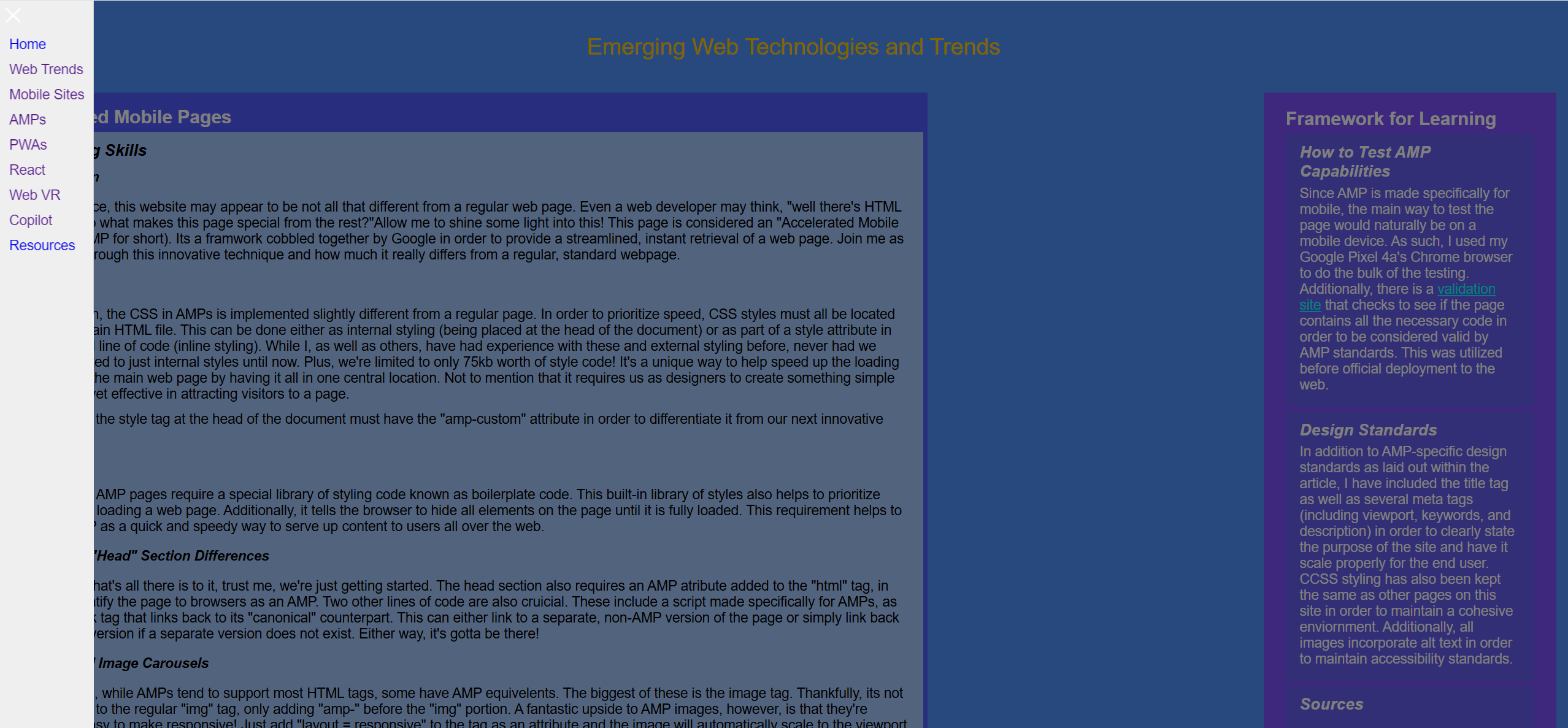
Finally, AMPs allow for an interesting variation of the navigation system via the "amp-sidebar" tag. It works remarkably similar to other nav bars we've used in the past, utilizing the "ul" and "li" tags for the page links. However, much like the afforementioned image carousels, the sidebar also requires additional script code to function.
Conclusion
Ultimately, AMP offers a lot of innovative variations on HTML and CSS code that provides a platform for web pages to be compelling in their simplicity, yet efficient in their top-notch speed and processing power. This is a trend that will change the world wide web for the better.